Blog

Turn Your House into a Home with Art
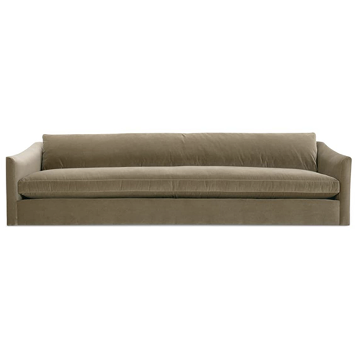
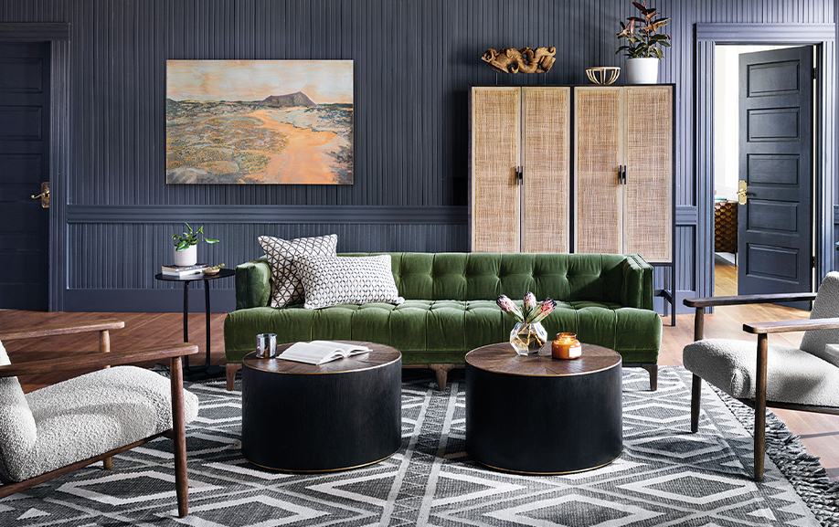
Art can bring beauty, joy, vibrancy, and serenity into your home. It places your dreams, personality, attitude and beliefs onto your walls for the world to see, and soothes the soul by surrounding you with what you love. Art is definitely worth the time, consideration, and investment but how do you make sure you are choosing something you love that fits your space and budget? Keep these tips in mind when shopping for, and hanging art, so your home is picture perfect. Hone In On What You Love Whether you adore abstract, have a penchant for portraits, or prefer pop art, there is something for everyone when it comes to choosing art. Remember, art is subjective, and it is important that you love (as you should love all you bring into your home) what you put on your walls. In fact, there are so many time periods and techniques to choose from - the world is your oyster when it comes to selecting art for your home. You also don't need to have a blue chip budget to fill your home with 'good' art. Think prints, giclees, tiles, plates, mirrors, and textiles too. Often how you arrange the items on your wall is the art in and of itself. Think Opposites Your art does not have to 'match' your home...I repeat "your art does not have to match your home." Have you ever walked into a home, or seen one in your favourite magazine or insta post, and been wowed by its composition. It most likely has some tension that is creating visual interest. In fact, homes become more interesting when there is tension and juxtaposition as it creates visual interest, depth and layers. When a room reads one note (everything is the same style, time period, etc.) it can make a room feel flat. How do we solve this? With art! Have a contemporary home...try still life or classic portraits in a gilt frame. Traditional home...add contemporary art with vibrant colours or black and white photography to keep it current and fresh. Play With Scale and Size There are two big trends in art right now...oversized and micro art. Oversized art is perfect for larger rooms with sofas and sectionals as it anchors the room and fills up the wall, whereas micro art acts like an exclamation point drawing focus and attention to a special piece of furniture or a corner with a beautiful sculpture. Its intentionally scaled-down proportions allows you to embrace negative space which is often overlooked in the decorating world. Go with a textured piece if you want softness or make a statement with organic shapes that creates contrast in a bold colour. Consider matching the frame colour with other colours or metallics that are found throughout the room. And if you want to go even larger than oversized, try a mural! Whether hand-painted or done in a gorgeous wall covering, murals create an atmosphere that will transport you into another world. Remember: when using wallpaper treat your wall as though it is only painted and hang your artwork on top to create more layers and depth (visual interest!!!) Think in Two's or Three's Diptychs and triptychs are a centuries-old art technique that were used for religious iconography in churches and cathedrals in the Middle Ages. Still relevant today, they offer a creative continuation of art when two or more individually framed pieces are hung together. Depending on the scale of the art and where it is being placed, hang each panel at eye level (see more on that below) with two to six inches between each panel, depending on the size of the art. Create a Collection Gallery walls can feel intimidating but they don't have to be. Plan the layout by tracing your art selection on brown paper or cardboard and tape these cutouts on the wall to play with configuration before you start nailing into the wall. Keep the frames all matching to be safe or go bold and mix and match. You don't have to stay married to a gallery wall. A great gallery wall could be a collection that takes years of adding to. Think beyond traditional art for your gallery wall. Sid Dickens Memory Blocks are collectible tiles that can be arranged in many ways. This Vancouver-based company has been making collectible memory block tiles for more than 30 years and Beige has carried these since 2007. These treasures become keepsakes for years to come. So The Art is Selected, Now How Do You Hang it? - Always follow any instructions that come with the artwork from the artist or manufacturer. Art when framed can be heavy and may require certain hooks and anchors to properly distribute the weight. When possible, hang heavy artwork directly into a stud. - Keep the centre of the artwork (or collection) eye level - around 60" from the floor to the centre of the artwork is a good height. - Hanging art over a sofa? Make sure it is at least 2/3rds the width of your sofa. - Have a larger art collection that you want to change regularly? Install a gallery hanging system that allows you to hang artwork on wires that can accommodate various sizes of artwork that you can hang at different heights. - Think of lighting too. Highlight beautiful artwork with overhead gallery lighting or a sconce. - Most importantly, have fun! Art has a notion of being pretentious and is taken too seriously. Buy what you love and enjoy it for years to come.
Learn more
Ten Paint Colors We Are Crazy For
Here's a list of the 10 paint colours were really feeling at the moment…Enjoy! 1) Farrow and Ball No 36 Mahogany - not brown, not eggplant but rich and sexy2) Farrow and Ball No 270 Calluna - grey with a hit of violet3) Benjamin Moore AF115 Lodge - a delicious muddy chocolate 4) Benjamin Moore AF535 Serenata- cool icy blue5) Benjamin Moore AF80 Jute - a fantastic warm neutral6) Benjamin Moore 995 Butter Cookie - muddy neutral yellow7) Benjamin Moore 625 Deep Secret- the perfect French navy8) Benjamin Moore CSP 980 Gilded Ballroom - the name says it all9) Benjamin Moore CC570 Forest Floor - masculine warm green10) Benjamin Moore OC 45 White Wing - white with a hit of warmth. Updated August 1st, 2023
Learn moreWhat's in High Point?
"So you drive 15 hours each way?!" "For a show? Is it necessary?" These are some of the questions we get asked when we do the trade show in High Point, NC. And to answer the questions.. YES It is worth it. Twice a year, dressed in comfy clothing, we make the trek across 7 states to North America's biggest furniture show. Revved up on 1/2 dozen Starbucks, beef jerky, and other nameless foods we eat only on these trips, we arrive to the hotel exhausted, only to down a platter of appetizers and a bottle of wine. I think there are 2 types of people that go to these shows. Those who go to every party, every signing, and every opening, and are there for the social aspect, and our category, where it is actually work. Our days start at 7 am, and usually end slumped in a chair in a restaurant around 8 pm. The amount of walking is paramount, as the show is massively spread out, often requiring a vehicle (hence the drive). The salad of exhibitors is monumental. From reclining sofas with built in cup holders, to 17th century antiques, it is a feast for the eyes. We have the luxury of seeing the best of the best, worst of the worst and in getting to meet design icons such as Thom Filicia, Kelly Wearstler, and Sheree from the Real Housewives of Atlanta! As we often spec items for our design clients, it's a fantastic way to "test drive" the product and have first hand knowledge. Introductions for new collections are first shown here, which allows us a portal into what is fresh and new. Or not :) Check out our Facebook and Instagram pages to see what's new and noteworthy!
Learn moreHave you painted yourself into a corner?
I was at Home Depot several weeks ago, picking up a quart of paint for the trim in my bathroom, and was astounded by a horrified scene. Several women, looking very overwhelmed and frustrated, were waiting for paint to get mixed. Being the naturally curious person I am, I spied over my shoulder, intrigued by their choices. One woman was obviously painting a good chunk of her house, judging by the gallons of paint filling her cart. I looked at the drying spots of color on each can, and prayed she was painting a daycare or playschool. Now , I realize color is very subjective, and contrary to the name of my store, I LOVE color. There was tweety bird yellow, a nasty blue, and a bright green. My mind raced as I imagined where these colors would go, and if she would be pleased with the result, or be so frustrated she would just live with it. Another woman was waving an old paint stick, that looked like it had been unearthed from a crypt, trying desperately to match her paint from her old house from 10 years ago. I wanted to clutch her and scream "The color had aged! It won't match!" but my voice caught in my throat. I wanted to give her a business card, but feared I would get kicked out, leaving paintless. Choosing paint colors is one of the most difficult feats, but can result in an inexpensive upgrade. Given the cost of paint, a 1 hour consultation with a professional can eliminate any guesswork. For instance, you want grey, but do you want a warm or cool grey? Green undertones or blue? It's not uncommon after a bad experience to just default to white, which is actually one of the trickiest colors to get right. A professional will get a feel for what tones you gravitate to, keeping in mind light, furnishings, and lifestyle. Are your walls uneven and in bad shape? Maybe matte is a better option. It's a small investment... unless you really just want white.
Learn moreWhy Beige ???
One of the questions I get asked the most ( more so upon opening) is..."Why Beige?/" "beige is boring". "of all the colors in the spectrum..why beige?" "Are you afraid of color?!!!!!" Then there are the jokes. Usually involving husbands and wives in bed and beige ceilings. My answer has been the same since the evolution of the store. Beige to me, is timeless, simple, classic. No one has ever said "Oh, I'm so tired of my BEIGE sofa, but I DO hear people complain about their teal, forest green or peach furniture. Colors tend to be very cyclical, ( grey appears to be the new beige) whether in home decor, fashion, cars. Look in a fashion magazine ( or decor magazine) from the past 20 years. A Calvin Klein ad from 1996 is pretty much interchangeable to one today. Clean, simple lines, classic fabrics, a neutral palette, these things don't date. I have always had an affinity for simplicity, for instance, linen, the texture, the crispness, how it softens and ages so gracefully. The name beige, the same in French or English, is simple. It' s a name people don't forget, which prevents us from simply being known as "That store on Notre Dame" As we approach our 7 year mark, my love for "beige" has stayed the same. Even though we have evolved, I feel our philosophy has remained true since day one.
Learn more